I get wonderful typography emails from several sources. There’s House Industries; there’s Fonts.com (Monotype Imaging); and, the most delicious, Myfonts.com (Bitstream). Do yourself a favor and get on their mailing lists.
Month: August 2012
Nice piece of corporate typography
 Normally I HATE corporate design — sterile, boring, characterless. But I think the typography that Lippincott did for Johnson Controls is quite nice. Click on the picture to see a larger version, or click here.
Nifty font
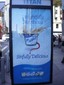
I thought the font used by  Sophie Yogurt was cool. Thanks to the font identifier at Myfonts.com, I found that it’s Sauna Swash Italic.
More Roger Excoffon type on the trucks
Antique Olive spotted on Rent-A-Center truck
Dollhouse clothing logo
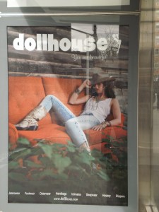
Dollhouse sells sexualized clothing for teens (ick). But I like the logo, which reminds me of ITC Grizzly.
Interjet logo
A couple days ago I saw the Interjet logo with its common case “j.” I think it looks really nice and serves to emphasize that they’re a jet transportation company. Pretty good for a discount Mexican airline.
I’ve been interested in common case (apparently now called “unicase”) fonts ever since I saw a common case version of Antique Olive published by infamous font vendor Leonard Storch.
My desert island book list
What type books would you take with you to a desert island?
My list might include:
- My TANY Typeface Specimens Directory — 1965 showing of foundry and hot metal fonts from the Typographers Association of New York
- A.T.A. Type Comparison Book by Frank Merriman — A gorgeous hardcover book published by the Advertising Typographers Association in 1965. All the major foundry and hot metal faces are grouped into 69 categories for easy reference. I had hoped that my office mate, designer Robert Schwartz, might give me his copy when he retired, but he wouldn’t give it up. I don’t blame him. I later bought a copy through Bookfinder.
- Rockledge’s International Type Finder — similar to the ATA book but for cold type.
- Robert Bringhurst’s The Elements of Typographic Style — a beautiful book about type faces and their use.
Foundries and typographers
I remember . . .
Headliners — one of the most beautiful type catalogs I ever saw. The fonts were all drawn exclusively for them and the settings in their catalog were exquisite. The Headliners fonts now belong to Joe Treacy’s Treacyfaces. I like some of Joe’s original faces (e.g., TFForever) but his website is unappealing.
Photolettering — I think they must have had the largest collection of custom headline fonts in the world. Some were quite astonishing, though my clients could never afford their prices. Their fonts have been acquired by House Industries, whose beautiful website you really must visit.
Alphabet Innovations and TypeSpectra were two lines of original fonts drawn and licensed by Phil Martin. A few of Phil’s fonts can be purchased through MyFonts.
MKP – Marvin Kommel Productions — Marvin had a typography shop with such a huge line of 2″ film fonts for headline setting that other shops would send jobs to him when they didn’t own the required font.
Franklin Photolettering — ordinary headline photo typesetting, but they had an unusually large range of fonts with funky swashes. (I had thought that their 2″ film fonts were purchased from the usual reputable and disreputable sources, but some searching on the Web suggests that they had several original faces of their own.)
Welcome TypeManiacs!
I’ve been a type lover for about 40 years, studying type catalogs (mostly cold type, but also foundry, dry transfer, PostScript, and TrueType) and using typography for my graphic design and web clients.
For the last year or so, I’ve wanted to blog about type, but hadn’t actually gotten around to it until I saw an article that suggested that people find material set in Baskerville is more believable than the same text set in other faces. (Thanks to my friend Warren for the heads up).
I’m happy to say that an old friend and fellow type lover will be blogging with me under the name “Matrix.” And, of course, other type lovers are invited to weigh in, too.


