Story 1
Back in the 1970s, NBC commissioned a new logo from Lippincott and Margulies at a reported cost of $750,000.
The problem was that it looked almost identical to the logo of the Nebraska Educational Telecommunications Network, for which NETV paid an estimated $75 (I sorely wish I remembered who designed NETV’s version).
Nebraska sued and NBC ended up paying them for the right to use the stylized “N” logo. We all had a good laugh at NBC’s and Lippincott’s expense. What few remember is that NBC got a whole corporate identity system for their dough, including signage, stationery, and God knows what else. If the deal included business card mechanicals for 12 gazillion NBC executives, that alone would have been worth thousands.
The other aspect no one talks about is this: If NBC had tried doing the design in-house, the suits would have fussed with it, showed it to their wives and ended up with crap. But when three-quarters-of-a-million-dollars design consultants showed up with their layouts, the suits were all “Ooooh, these guys must be really smart.”
Story 2
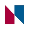
One of the web pages that tell the NBC/NETV story uses this logo:

According to recent news reports, NY State is suing infringers like them. Oopsies!
Story 3
But why am I writing all this? Because I saw a story in the NY Post about Brooklyn College spending $107,000 on a new logo. The logo is nice but hardly earth-shattering. However, just like the old NBC fracas, the fee covered a lot more than the logo. They got a CI manual (nowadays fashioned a “Visual Identity System”), a web redesign, a virtual tour, and admission publications; all from a competent design shop. Not only that, the designers threw in some blather about “brand strategy,” “strategic direction,” and “comprehensive implementation plan” to keep the suits happy.
Brooklyn College logo