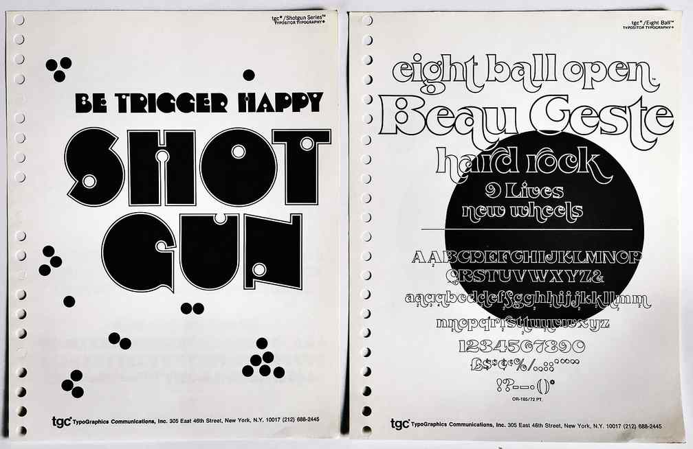
I remember . . .
Headliners — one of the most beautiful type catalogs I ever saw. The fonts were all drawn exclusively for them and the settings in their catalog were exquisite. The Headliners fonts now belong to Joe Treacy’s Treacyfaces. I like some of Joe’s original faces (e.g., TFForever) but his website is unappealing.
Photolettering — I think they must have had the largest collection of custom headline fonts in the world. Some were quite astonishing, though my clients could never afford their prices. Their fonts have been acquired by House Industries, whose beautiful website you really must visit.
Alphabet Innovations and TypeSpectra were two lines of original fonts drawn and licensed by Phil Martin. A few of Phil’s fonts can be purchased through MyFonts.
MKP – Marvin Kommel Productions — Marvin had a typography shop with such a huge line of 2″ film fonts for headline setting that other shops would send jobs to him when they didn’t own the required font.
Franklin Photolettering — ordinary headline photo typesetting, but they had an unusually large range of fonts with funky swashes. (I had thought that their 2″ film fonts were purchased from the usual reputable and disreputable sources, but some searching on the Web suggests that they had several original faces of their own.)

