MrMild (he’s our Northern Correspondent) was chewing the fat with the Typemaniac over some old tech, like vertical studio cameras (the Agfa camera sucked big time but it was cheap so everyone bought it). . . . Now where was I? Oh, yeah. MrMild and I were talking about making veloxes using bump and flash exposures. MrMild then located this fine web page by Wendy Mukluk that covers all of that fine old tech. Read and enjoy!
Month: January 2016
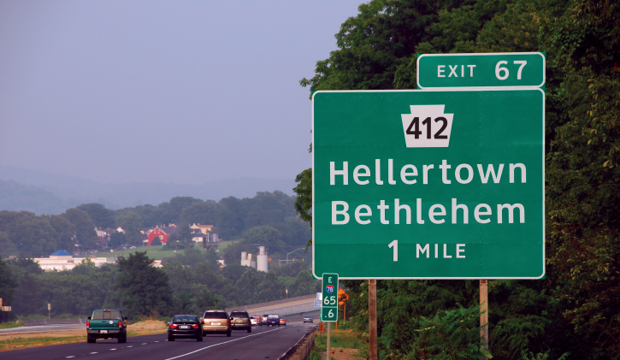
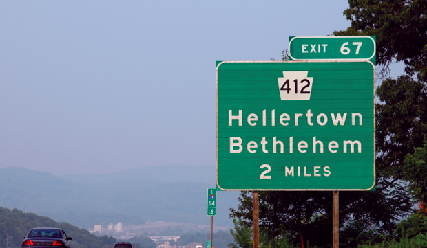
The Official U.S. Highway Sign Font Is Changing From Clearview to Highway Gothic
The U.S. Federal Highway Administration approved the use of the Clearview font for highway signage back in 2004, because testing showed that it contributed to increased readability. The approval has now been rescinded, so future signage will be in good old Highway Gothic. According to the FHWA, the legibility claims for Clearview have been disproven, though the agency has yet to reveal any scientific basis for their change.
Source: The Official U.S. Highway Sign Font Is Changing From Clearview to Highway Gothic – CityLab
More background at the New York Times: The Road to Clarity
Thanks to one of our Typographic Irregulars, MrMild.
Nile Peterson on Flickr
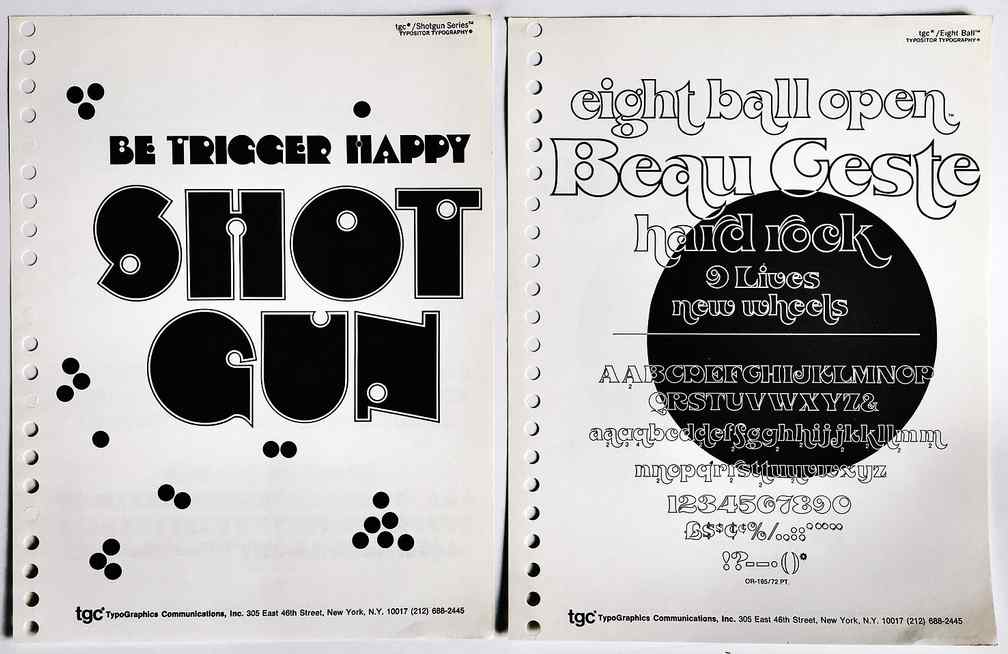
 Nile Peterson has put together an astonishingly beautiful collection of typography samples and covers of typography specimen books. How did I come across this? I was searching for the Franklin Photolettering Film Alphabet Compendium.

