1

Font: Atkinson Hyperlegible

Atkinson Hyperlegible is a freely available typeface built around a grotesque sans-serif core, intended to be optimally legible for readers who are partially visually impaired, with all characters easily distinguishable from one another. It was developed by the Braille Institute of America in collaboration with Applied Design Works and is available under the SIL Open Font License. It won Fast Company‘s Innovation by Design Award for Graphic Design in 2019 and was shortlisted for a graphic design award by Dezeen in 2020.

What a great idea! Trying to tell a cap I from a lower case el on a computer screen is sometimes impossible. Even distinguishing a B from an 8 can be a challenge.

From Wikipedia. And thanks to Bill W for telling the Typemaniac about this cool font.Related: aovXKP, Mpcy, KAf, Sfy, jPka, fjGj, DJZY, PZva, TQCtx, hvBT, CBzy, rvyf, ULoHh, uIY, YeZib,
0

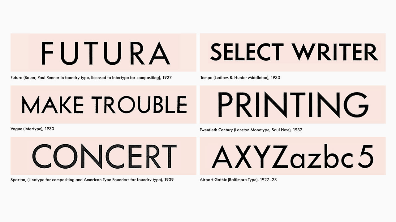
How Futura Became The Most Ripped-Off Typeface In History

Companies from Best Buy to Forever 21 use Futura, but probably not the original. That’s because it has been endlessly reimagined, imitated, and blatantly ripped off.

Thanks to MrMild, our Chief Investigative Typographer, for bringing this article to our attention. It’s a bit breathless, but still a fun read for lovers of type.

Source: How Futura Became The Most Ripped-Off Typeface In History | Co.Design

0

Meet the Font Detectives Who Ferret Out Fakery

A quiet side business among typography experts is every kerning nerd’s dream job—and a surprisingly high-stakes game.

Thanks to a certain retired writer from up North for sending us this article about lawsuits that turn on font identification — and the font experts who are hired to testify.

Source: Meet the Font Detectives Who Ferret Out Fakery | Backchannel

0

A fake font download installs malware on your computer

One of the most common malware campaigns from compromised websites is known as EITest and has traditionally been redirecting victims towards exploit kits. But it also has an alternate payload for browsers other than Internet Explorer, specifically for Google Chrome, where it tricks users into downloading a fake font file.

Source: A story of fonts by the EITest HoeflerText campaign – Malwarebytes Labs

Hat tip to our Internet Security Correspondent “Mr Mild.”

0

Snapchat changed its font and now life just doesn’t make sense anymore

According to graphic designer Tynan Humphrey, the old font appeared to be Helvetica while the new font looks like Avenir. “It’s a little lighter, and a bit more geometric than the old font,” he told the Daily Dot.

Snapchat changed one of their app’s fonts and hilarity ensued. Click to read the DailyDot article: Snapchat changed its font and now life just doesn’t make sense anymore

Hat tip to MrMild.

0

The Official U.S. Highway Sign Font Is Changing From Clearview to Highway Gothic


Clearview is out.


Highway Gothic is back in.

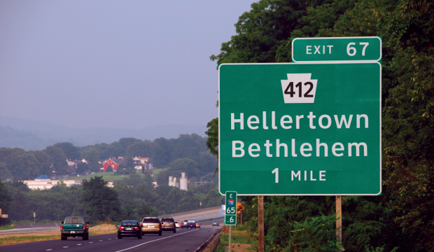
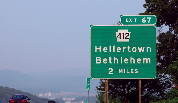
The U.S. Federal Highway Administration approved the use of the Clearview font for highway signage back in 2004, because testing showed that it contributed to increased readability. The approval has now been rescinded, so future signage will be in good old Highway Gothic. According to the FHWA, the legibility claims for Clearview have been disproven, though the agency has yet to reveal any scientific basis for their change.

Source: The Official U.S. Highway Sign Font Is Changing From Clearview to Highway Gothic – CityLab

More background at the New York Times: The Road to Clarity

Thanks to one of our Typographic Irregulars, MrMild.