0

Inquiring minds want to know — Calibri

This arrived recently from our buddy, J.R. Wilheim:

“A few years back, MS Word changed the default font from Times New Roman to Calibri.  At the time I was baffled by it, but as it wasn’t too hard to switch into Times New Roman (and as I eventually figured out how to switch the default font myself in Office) I didn’t pay it much mind.  I got into a discussion recently with someone about changes to Office and as a result decided to look up exactly why this change was made.  Apparently, at the time Office 2007 was released, there was a widespread (and, as it turns out, correct) belief that more and more document production would not involve paper, and that Calibri was easier to read on screens that Times New Roman.  As someone in web graphic design, do you think there’s any merit to this?  I can’t see why paper v. online would have any effect on how readable a font is, but you obviously know a lot more about it than I do.”

The Typemaniac answered:
Short answer:
Typical resolution of a home printer is ~200 dots per inch
Typical resolution of a computer screen is ~96 pixels per inch
At small sizes, a font optimized for print won’t look too good on screen and vice-versa.
1

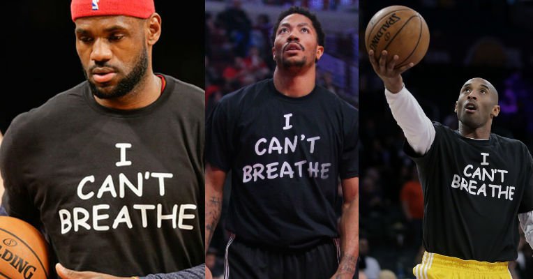
Font vigilantes attack “I can’t breathe” tee-shirts

Our West Coast correspondent spotted this “tempête dans un verre d’eau” about Comic Sans on the Dangerous Minds website. Apparently there’s been quite the little debate over the font used on some “I can’t breathe” tee-shirts.

The Typemaniac doesn’t give a hoot one way or another (he would have used Banco) but he’s happy for anything that promotes public awareness of typography.

Idiotic hipsters complain about the font of ‘I Can’t Breathe’ protest shirts | Dangerous Minds.

0

Welcome TypeManiacs!

I’ve been a type lover for about 40 years, studying type catalogs (mostly cold type, but also foundry, dry transfer, PostScript, and TrueType) and using typography for my graphic design and web clients.

For the last year or so, I’ve wanted to blog about type, but hadn’t actually gotten around to it until I saw an article that suggested that people find material set in Baskerville is more believable than the same text set in other faces. (Thanks to my friend Warren for the heads up).

I’m happy to say that an old friend and fellow type lover will be blogging with me under the name “Matrix.” And, of course, other type lovers are invited to weigh in, too.