Someone at the Yiddish Book Center is channeling the late designer and typographer Herb Lubalin. Looks great!
Typography
Typography Can Save Lives
According to Lena Groeger of ProPublica, “type choices are a big deal — and can, in fact, have life or death consequences.”
See the article from ProPublica entitled “How Typography Can Save Lives.” It’s full of interesting tidbits, e.g. why big blocks set in ALL CAPS are still so common.
Apparently, the U.S. government defines “conspicuous” as “a heading in capitals equal to or greater in size than the surrounding text.” Why? Because back in the day of typewriters, capital letters were the only emphasis option available.

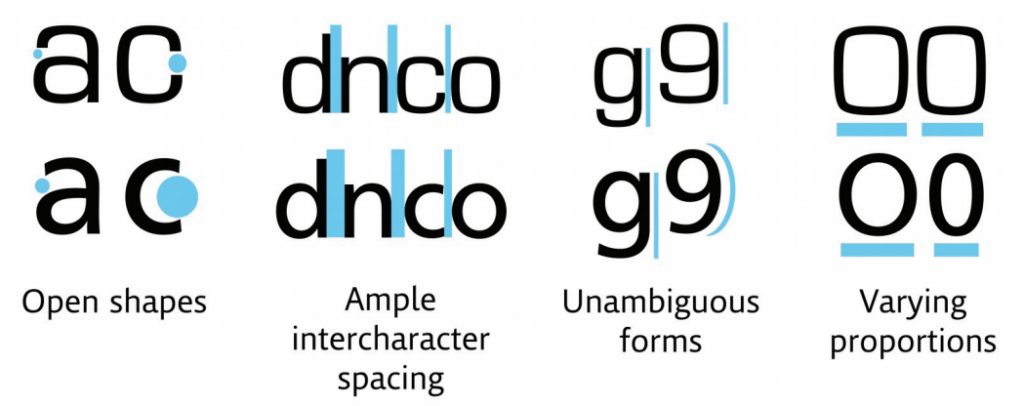
MIT collaborated with Monotype to design a typeface that cuts down on driver distraction. A square-shaped typeface (Eurostile) on top compared to the humanist typeface (Frutiger) on the bottom. Source: Monotype Imaging.
Personally, I’m delighted to know that NOAA, the National Weather Servce whose forecasts I consult every day, has made their hazardous weather alerts legible. Now I’ll be able to find Rockingham County in a list of affected counties ten times faster.
Homage to Dry Transfer Lettering
Steven Heller writes about the old days of burnishers and silicon backing sheets.
The Beauty of Letterpress
Neenah Paper brings us a gallery of contemporary letterpress printing. Check out the link and feel free to drool over the beautiful pictures.
Source: The Beauty of Letterpress
If You Love That Font So Much, Why Don’t You Date It?
“If I were going to date a typeface, it would probably be something like Franklin Gothic bold condensed. The font is undeniably masculine—sans-serif, solid, reliable. If it were a human, it’d be the type of guy who would fix my broken sink and play football in the backyard on Thanksgiving. I’m not alone here. Lots of women find Franklin Gothic to be a total dreamboat.”
Besides gauging dateability, graphic designer Sarah Hyndman is researching how typography impacts our perceptions in other ways:
- Can a font make a product appear more expensive?
- Do fonts have recognisable personalities?
- Can a typeface alter the taste of what you eat?
- Can a font alter the mood of what you read?
- When is a Serif a better choice than a Sans Serif typeface and why?
Source: If You Love That Font So Much, Why Don’t You Date It?
Hat tip: our Northern Font Observatory, headed up by MrMild.
Nile Peterson on Flickr
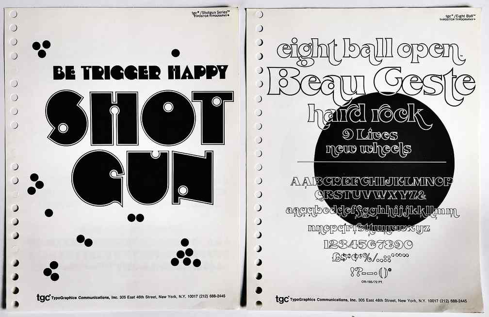
 Nile Peterson has put together an astonishingly beautiful collection of typography samples and covers of typography specimen books. How did I come across this? I was searching for the Franklin Photolettering Film Alphabet Compendium.
Meet The Obscure Exclamation Comma: Because Excitement Can Happen In The Middle Of A Sentence
World, meet the exclamation comma — the punctuation mark you didn’t know existed, but that you almost certainly need in your life.
Source: Meet The Obscure Exclamation Comma: Because Excitement Can Happen In The Middle Of A Sentence
Love that Annie typography
Book designer meets programmer — Hebrew book composition
Our bud Larry Yudelson sent us a link to this neat article by Raphael Freeman, showing how he uses a variety of custom scripts to compose complex book pages in Hebrew.
I’ve sent a note to Raphael asking what page layout program he’s using. I’ll reveal all when he gets back to me.
via Book designer meets programmer | Raphael Freeman | Ops & Blogs | The Times of Israel.
Hebrew Typography blog
Be sure to check out this wonderful blog about Hebrew typography: Hebrew Typography. (Unfortunately, the blog hasn’t been updated since 2012. Bummer.)


