I was doing some educational research on the Web, when I ran across a cool, swashy script being used on a magazine cover. I didn’t recognize it, so I asked over at WhatTheFont. One of the mavens there identified it as Scriptina Pro. Apparently designed and distributed for free by Fredrick “Apostrophe” Nader, it’s been cleaned up and extended by CheapProFonts. You can get for free from MyFonts.com. As you can see, it’s gorgeous.
Month: January 2013
Trend Font from YouWorkForThem
YouWorkForThem was selling the 21-font Trend family for $19, so I figured what the heck and bought it. Don’t know when I’ll use it but it’s hard to resist a bargain.

Benguiat fonts from House Industries
House Industries has released several fonts by Ed Benguiat that I hadn’t seen before. Best of all you can try them out!
Quicksilver font
Somewhere back in the 1970’s, Letraset issued Dean Morris’ Quicksilver typeface as dry transfer lettering. Now Dean collects pictures of his funky face in use. See his Quicksilver Font Museum.

38 Of the most beautiful typeface designs released this winter
New coffee table book for typemaniacs
The Anatomy of Type by Stephen Coles, with a foreword by Erik Spiekermann, was published in November, 2012. I haven’t seen it personally but it looks to be a very pretty book with a full-page spread devoted to each of 100 typefaces.
Keys to the Kingdom
I thought The Elements of Typographic Style Applied to the Web might be the Holy Grail of web typography but this adaptation of Bringhurst’s principles to a typographically-hobbled web ground to an unexplained halt in 2006. Most of Richard Rutter’s Web Typography and Clagnut site files were lost to a “catastrophic database failure,” aka no database back-up, but he’s gradually restoring as much as he can from archives.
Do any of my fellow TypeManiacs believe The Elements is still a feasible project? If they do, and If Mr. Rutter is too busy to finish it, would they be interested in collaborating?
Beautiful Guardian font range
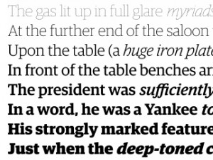
Here’s a wonderful family of fonts, 136 in all, designed by Paul Barnes and Christian Schwartz for Mark Porter’s 2005 redesign of The Guardian. You’ll find serif and sans, headline and text, hairline to extra bold, regular and condensed. There is also a range of “agate” fonts for use in setting classifieds, and tabular matter such as stock market tables. If you want to buy this for me for Christmas, it’s only $1850.00 for all 136 fonts (less than $14 each).


