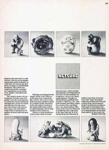
Someone at the Yiddish Book Center is channeling the late designer and typographer Herb Lubalin. Looks great!
Graphic design
Typography Can Save Lives
According to Lena Groeger of ProPublica, “type choices are a big deal — and can, in fact, have life or death consequences.”
See the article from ProPublica entitled “How Typography Can Save Lives.” It’s full of interesting tidbits, e.g. why big blocks set in ALL CAPS are still so common.
Apparently, the U.S. government defines “conspicuous” as “a heading in capitals equal to or greater in size than the surrounding text.” Why? Because back in the day of typewriters, capital letters were the only emphasis option available.
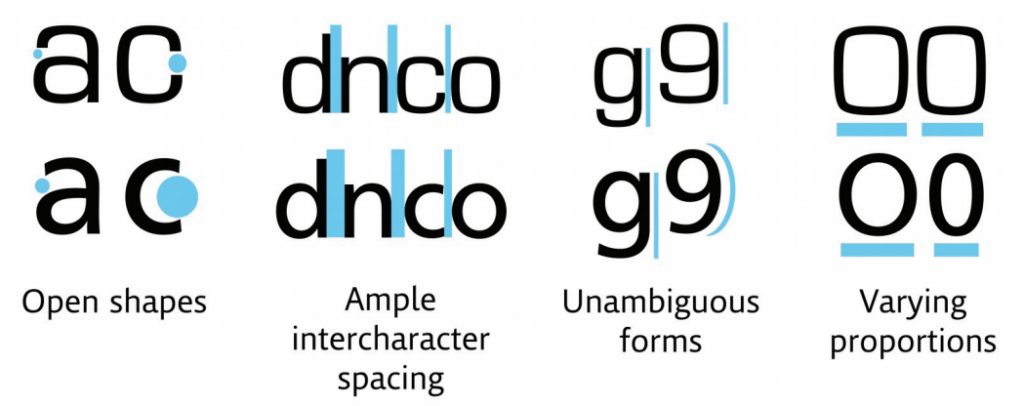
MIT collaborated with Monotype to design a typeface that cuts down on driver distraction. A square-shaped typeface (Eurostile) on top compared to the humanist typeface (Frutiger) on the bottom. Source: Monotype Imaging.
Personally, I’m delighted to know that NOAA, the National Weather Servce whose forecasts I consult every day, has made their hazardous weather alerts legible. Now I’ll be able to find Rockingham County in a list of affected counties ten times faster.
New Print Technologies Help Art Books Survive in a Digital World
Printed art books, often with special cover coatings, embossing and extravagant illustrations, deliver a sense of tactile immediacy.
Although the Typemaniac lives in front of a computer, he still loves buying, owning and reading real books. Thanks to Tony Zak, a member of our Northern Bureau, we now learn that art books are flourishing as meatworld objets d’art. Very cool!
Source: New Print Technologies Help Art Books Survive in a Digital World – The New York Times
The Beauty of Letterpress
Neenah Paper brings us a gallery of contemporary letterpress printing. Check out the link and feel free to drool over the beautiful pictures.
Source: The Beauty of Letterpress
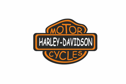
Famous logos redrawn in Comic Sans
Love that Annie typography
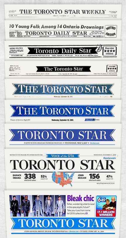
A look at newspaper logo trends and styles
I love looking at how logos have changed over the years. I remember seeing an article that showed the development of the Campbell’s and ShopRite logos. Today, I stumbled on Matthew French’s article about newspaper nameplates (i.e., logos). Enjoy!
What’s in a nameplate? A look at newspaper logo trends and styles.
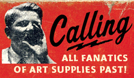
The Museum of Forgotten Art Supplies
If you’re old enough to remember when a Speedball was a kind of lettering pen, check out The Museum of Forgotten Art Supplies.
And a hat-tip to Simone Weissman.
When Bruce met Gypsy Rose . . .
Lessons in type
Monotype has a fine series of lessons in type on their fonts.com website. The most recent posting, authored by Ilene Strizver, is about the use of columns in design.


