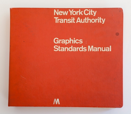
Massimo Vignelli’s redesign of the signage of New York City Transit Authority in 1970 was a major example of the International Style or Swiss Style of graphic design. The graphics standards manual was credited to Unimark (Massimo Vignelli was one of its the founders and partners), and is now available online (click on Original Manual) thanks to the efforts of Niko Skourtis, Jesse Reed, and Hamish Smyth. The copy they have posted once belonged to the famous Pentagram graphic design collective.
See the manual. Thanks to the HuffPost for the link.
I have no problem with the Vignelli design (though there have been attempts to improve on it). My main complaint is that, 40 years later, the implementation of the system’s signage is so incomplete and inconsistent, that visitors frequently get lost below ground.
See Paul Shaw’s article about transit signage and NYC’s in particular.

You can buy a reprint of the manual for $55: https://standardsmanual.com/products/nyctacompactedition
Nick Sherman drew a font, based on the Unimark signage font. He calls it NYCTA Standard Medium (https://standardsmanual.com/pages/type-specimen). Sadly, it is not commercially available.