 Nile Peterson has put together an astonishingly beautiful collection of typography samples and covers of typography specimen books. How did I come across this? I was searching for the Franklin Photolettering Film Alphabet Compendium.
Author: typemaniac
This just in from our West Coast correspondent
Tony Cultreri, our West Coast correspondent, is charged with keeping us up to date with all the latest typographic happenings in the fabulous Los Angeles area. Here are his latest submissions:
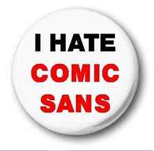
Famous logos redrawn in Comic Sans
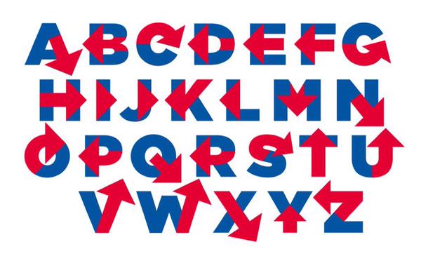
Funky swash font
I spotted this pretty thing in the West Side Spirit, a community newspaper. The font is Thirsty Script Black by Ryan Martinson of Yellow Design Studio. The MyFonts website describes it as having a new look with a vintage vibe. At $20, it’s a bargain.
Similar fonts include Nexa Script Heavy (Ani Petrova) and Sant’Elia Script Black (Ryan Martinson).
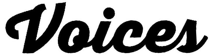
Love them unicase fonts

This is from the “Make Do With What You Got” album by Solomon Burke. I didn’t recognize the font, so I asked at the WhatTheFont forum. Akira1975 identified the font as House Gothic 23 Condensed Bold 4.
Inquiring minds want to know — Calibri
This arrived recently from our buddy, J.R. Wilheim:
“A few years back, MS Word changed the default font from Times New Roman to Calibri. At the time I was baffled by it, but as it wasn’t too hard to switch into Times New Roman (and as I eventually figured out how to switch the default font myself in Office) I didn’t pay it much mind. I got into a discussion recently with someone about changes to Office and as a result decided to look up exactly why this change was made. Apparently, at the time Office 2007 was released, there was a widespread (and, as it turns out, correct) belief that more and more document production would not involve paper, and that Calibri was easier to read on screens that Times New Roman. As someone in web graphic design, do you think there’s any merit to this? I can’t see why paper v. online would have any effect on how readable a font is, but you obviously know a lot more about it than I do.”
The Typemaniac answered:
Short answer:
Typical resolution of a home printer is ~200 dots per inch
Typical resolution of a computer screen is ~96 pixels per inch
At small sizes, a font optimized for print won’t look too good on screen and vice-versa.
Meet The Obscure Exclamation Comma: Because Excitement Can Happen In The Middle Of A Sentence
World, meet the exclamation comma — the punctuation mark you didn’t know existed, but that you almost certainly need in your life.
Source: Meet The Obscure Exclamation Comma: Because Excitement Can Happen In The Middle Of A Sentence
Foundry: Elfring Fonts

While talking to Howard Sobel today, he mentioned Gary Elfring, who’s been turning out fonts for many years. Gary’s specialties include bar code, scanning, and MICR fonts; he also will produce custom fonts for you. Take a look at the Elfring Fonts website.
Anyone remember WUGNET?
Many years ago — meaning probably in the early 1990s — there was WUGNET, the Windows User Group. It was dedicated to sharing tips and tricks about the then-new Windows operating system. WUGNET published a journal, reviewed software utilities, managed Compuserve forums (that takes me back!) and published several books about Windows.
Back in the day, the Typemaniac occasionally contributed to the Wugnet Journal. In particular, he wrote a memorable column about some of the type tools we were using back then — things like Publisher’s Type Foundry (Zsoft), WFNboss (Corel), and Refont (Acute Systems).
Now the Typemaniac is preparing to write up some of the tools he’s using currently: FontForge (open source, originated by George Williams), Font Creator (HighLogic), Type Tool 3 (FontLab), and FontExplorer X Pro (Monotype).
But wouldn’t it be cool to also reprint his original WUGNET article? Unfortunately, the Typemaniac’s Bloated Archive of Old Stuff seems to have gone missing, so he did the next best thing and contacted his old buds at WUGNET, Joel Diamond and Howard Sobel. Howard and Joel scoured every nook and cranny of the office, but sadly, it turns out that their archives are also MIA.
So if anyone knows where to get the WUGNET Journal where our type tool article appeared, please get in touch. We’ll gladly scan it and return it to you and even pay you a couple of bucks.