You don’t have to agree with the definitions supplied by YouWorkForThem to enjoy their glossary of font nomenclature. See: What Do Font Names Actually Mean? | YouWorkForThem Blog
You don’t have to agree with the definitions supplied by YouWorkForThem to enjoy their glossary of font nomenclature. See: What Do Font Names Actually Mean? | YouWorkForThem Blog
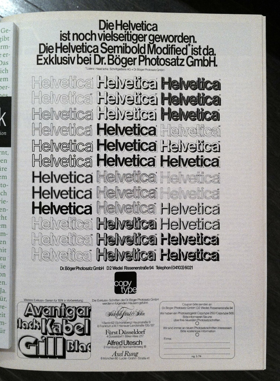
Dr. Böger Photosatz GmbH was founded in 1934 by Marius Böger (or Boeger). They made photocopying machines. Later, as Scangraphic, they got into typesetting equipment and fonts. In 2004, their font designs were acquired by Elsner&Flake.
What set the company apart in the 60s and 70s was the neat range of inlined, outlined and shadowed fonts that they produced.
Steven Heller writes about the old days of burnishers and silicon backing sheets.
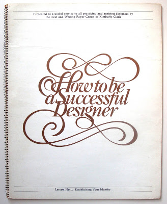
Huge thanks to Robin Benson for posting scans of this classic promotional piece from Kimberly-Clark. What Robin didn’t know was that the Typemaniac was the model for “Mountain Man” featured on page 9.
Source: Past Print: How to be a successful designer / Kimberly-Clark / 1975
Printed art books, often with special cover coatings, embossing and extravagant illustrations, deliver a sense of tactile immediacy.
Although the Typemaniac lives in front of a computer, he still loves buying, owning and reading real books. Thanks to Tony Zak, a member of our Northern Bureau, we now learn that art books are flourishing as meatworld objets d’art. Very cool!
Source: New Print Technologies Help Art Books Survive in a Digital World – The New York Times

Neenah Paper brings us a gallery of contemporary letterpress printing. Check out the link and feel free to drool over the beautiful pictures.
Source: The Beauty of Letterpress
According to graphic designer Tynan Humphrey, the old font appeared to be Helvetica while the new font looks like Avenir. “It’s a little lighter, and a bit more geometric than the old font,” he told the Daily Dot.
Snapchat changed one of their app’s fonts and hilarity ensued. Click to read the DailyDot article: Snapchat changed its font and now life just doesn’t make sense anymore
Hat tip to MrMild.
“If I were going to date a typeface, it would probably be something like Franklin Gothic bold condensed. The font is undeniably masculine—sans-serif, solid, reliable. If it were a human, it’d be the type of guy who would fix my broken sink and play football in the backyard on Thanksgiving. I’m not alone here. Lots of women find Franklin Gothic to be a total dreamboat.”
Besides gauging dateability, graphic designer Sarah Hyndman is researching how typography impacts our perceptions in other ways:
Source: If You Love That Font So Much, Why Don’t You Date It?
Hat tip: our Northern Font Observatory, headed up by MrMild.
MrMild (he’s our Northern Correspondent) was chewing the fat with the Typemaniac over some old tech, like vertical studio cameras (the Agfa camera sucked big time but it was cheap so everyone bought it). . . . Now where was I? Oh, yeah. MrMild and I were talking about making veloxes using bump and flash exposures. MrMild then located this fine web page by Wendy Mukluk that covers all of that fine old tech. Read and enjoy!
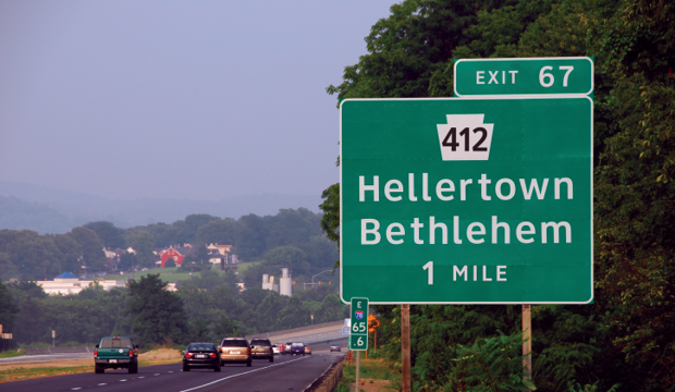
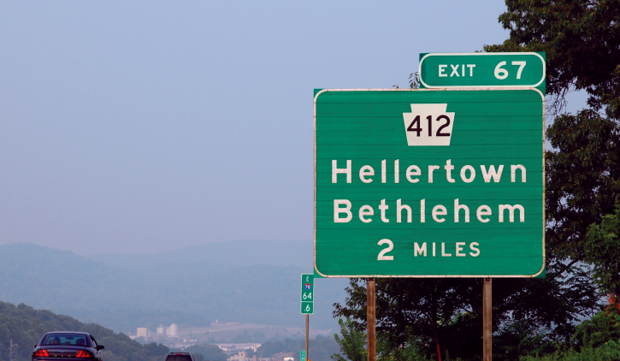
Clearview is out.
Highway Gothic is back in.
The U.S. Federal Highway Administration approved the use of the Clearview font for highway signage back in 2004, because testing showed that it contributed to increased readability. The approval has now been rescinded, so future signage will be in good old Highway Gothic. According to the FHWA, the legibility claims for Clearview have been disproven, though the agency has yet to reveal any scientific basis for their change.
Source: The Official U.S. Highway Sign Font Is Changing From Clearview to Highway Gothic – CityLab
More background at the New York Times: The Road to Clarity
Thanks to one of our Typographic Irregulars, MrMild.