0

Typography Can Save Lives

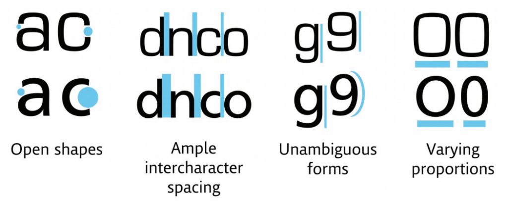
According to Lena Groeger of ProPublica, “type choices are a big deal — and can, in fact, have life or death consequences.”

See the article from ProPublica entitled “How Typography Can Save Lives.” It’s full of interesting tidbits, e.g. why big blocks set in ALL CAPS are still so common.

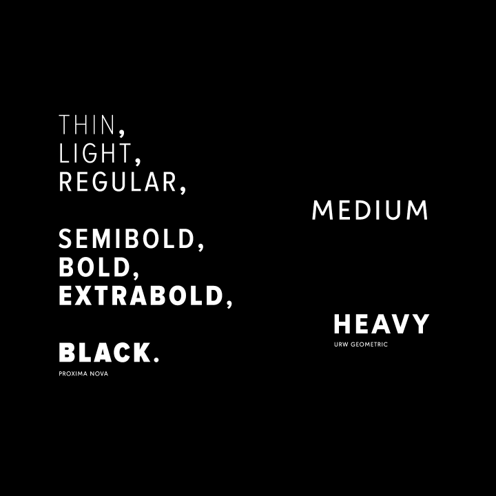
Apparently, the U.S. government defines “conspicuous” as “a heading in capitals equal to or greater in size than the surrounding text.” Why? Because back in the day of typewriters, capital letters were the only emphasis option available.

Graphic illustration of the changes made to a humanist typeface by MIT and Monotype.

MIT collaborated with Monotype to design a typeface that cuts down on driver distraction. A square-shaped typeface (Eurostile) on top compared to the humanist typeface (Frutiger) on the bottom. Source: Monotype Imaging.

Personally, I’m delighted to know that NOAA, the National Weather Servce whose forecasts I consult every day, has made their hazardous weather alerts legible. Now I’ll be able to find Rockingham County in a list of affected counties ten times faster.

0

New Print Technologies Help Art Books Survive in a Digital World

Printed art books, often with special cover coatings, embossing and extravagant illustrations, deliver a sense of tactile immediacy.

Although the Typemaniac lives in front of a computer, he still loves buying, owning and reading real books. Thanks to Tony Zak, a member of our Northern Bureau, we now learn that art books are flourishing as meatworld objets d’art. Very cool!

Source: New Print Technologies Help Art Books Survive in a Digital World – The New York Times

0

Snapchat changed its font and now life just doesn’t make sense anymore

According to graphic designer Tynan Humphrey, the old font appeared to be Helvetica while the new font looks like Avenir. “It’s a little lighter, and a bit more geometric than the old font,” he told the Daily Dot.

Snapchat changed one of their app’s fonts and hilarity ensued. Click to read the DailyDot article: Snapchat changed its font and now life just doesn’t make sense anymore

Hat tip to MrMild.

1

If You Love That Font So Much, Why Don’t You Date It?

dating“If I were going to date a typeface, it would probably be something like Franklin Gothic bold condensed. The font is undeniably masculine—sans-serif, solid, reliable. If it were a human, it’d be the type of guy who would fix my broken sink and play football in the backyard on Thanksgiving. I’m not alone here. Lots of women find Franklin Gothic to be a total dreamboat.”

Besides gauging dateability, graphic designer Sarah Hyndman is researching how typography impacts our perceptions in other ways:

  • Can a font make a product appear more expensive?
  • Do fonts have recognisable personalities?
  • Can a typeface alter the taste of what you eat?
  • Can a font alter the mood of what you read?
  • When is a Serif a better choice than a Sans Serif typeface and why?

Source: If You Love That Font So Much, Why Don’t You Date It?

Hat tip: our Northern Font Observatory, headed up by MrMild.